

Product cards and badges
Set how every product card in Kera looks, which photos it shows, its color swatches, and its Sale, Sold out, New and metafield badges.
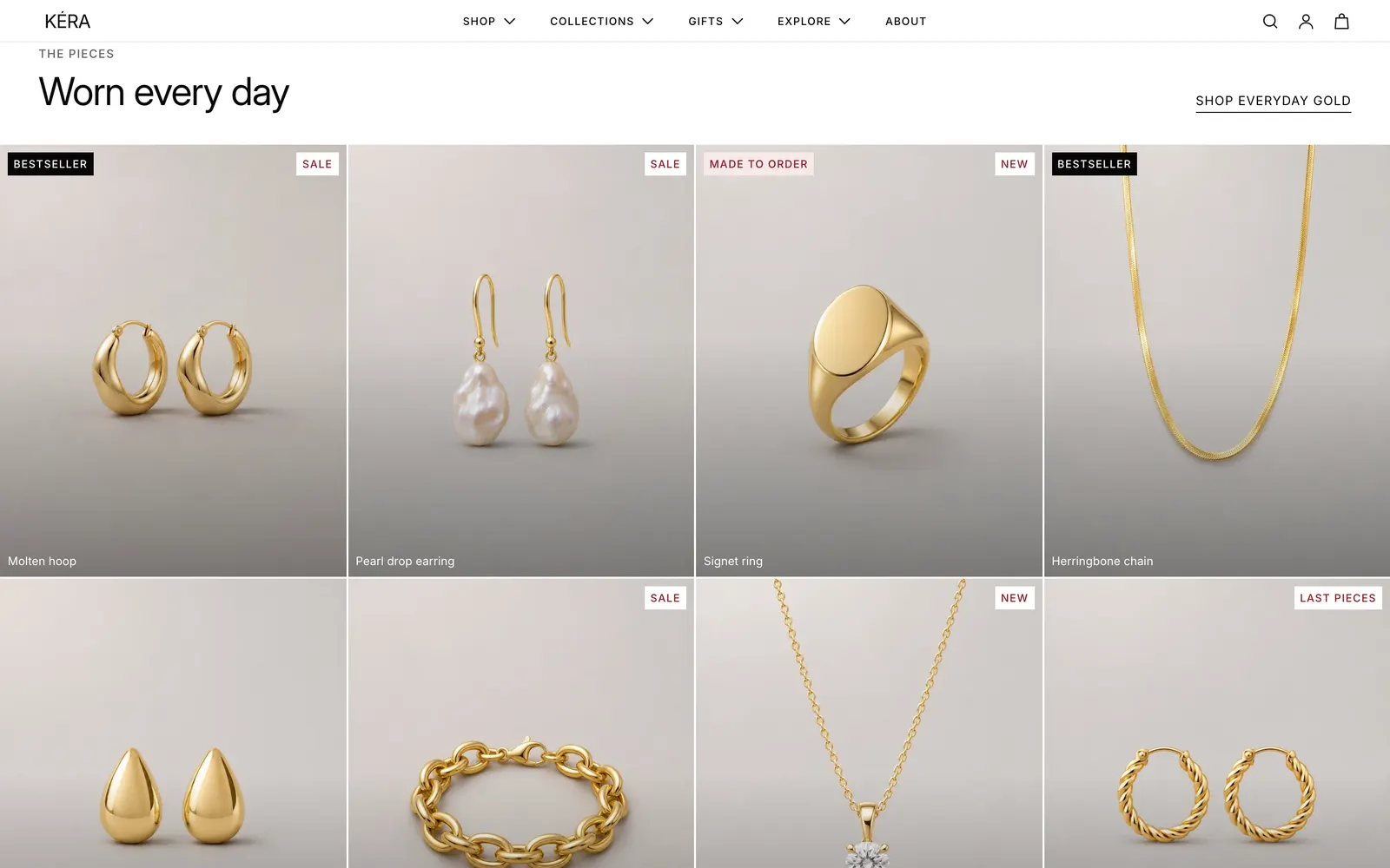
Every product grid uses the same card: collection pages, search results, Featured collection, Related products and the rest. Set it once here; sections only choose the products and columns.
Set it up#
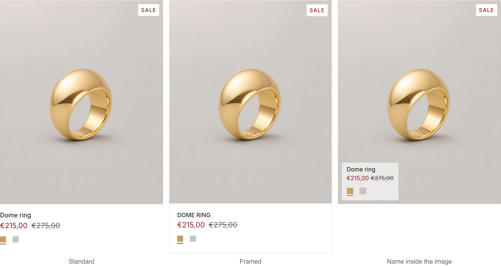
- Pick a Card style: Standard, Framed or Name inside the image. Installs as Name inside the image.
- Choose First image: Worn (each product's second image) or Still (product only) (the first image). Installs as Still (product only).
- Pick how Product images behave and the Image aspect ratio.
- In Theme settings > Badges, choose which badges show and their colors.
Do it with Sidekick
Open Sidekick in the theme editor and paste this, with your own names. Check the preview, then click Save.
In Theme settings > Product cards, set Card style to Name inside the image, Text on the image to Frosted label, First image to Worn, and turn on Show color swatches.
Settings#
Product cards
Card style: where the name, price and swatches go. Installs as Name inside the image.
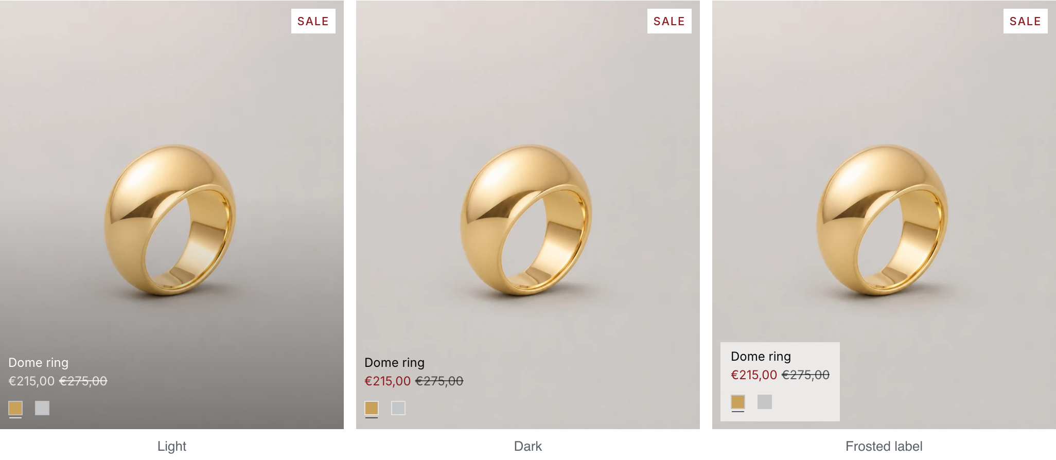
Text on the image: with Name inside the image, how the name reads on the photo. Installs as Frosted label, which stays readable on any photo.
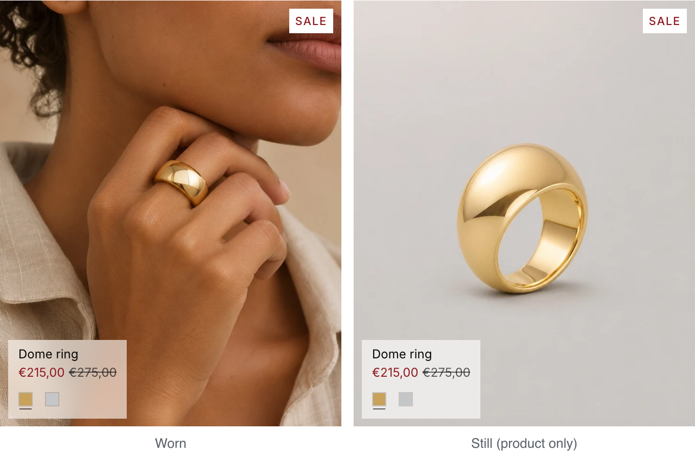
First image: Worn shows each product's second image, Still (product only) the first. Installs as Still (product only). Shoppers can switch with the Worn / Still toggle.
Product images: what the card does under the pointer. Installs as Second image on hover. Main image only never changes. Gallery adds arrows on desktop and swipe on phones, up to 10 images. Follow the mouse picks the image from the pointer's position.
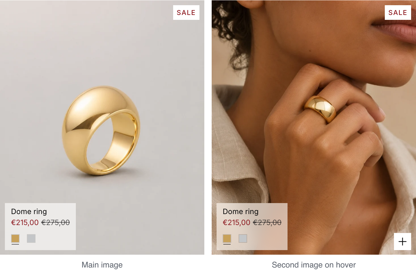
Play videos: when a product's first media is a video uploaded to Shopify, the card plays it muted on a loop while the card is on screen. When the second media is a video, it plays muted on a loop while the pointer is over the card, wherever the card shows that image: as the first image with First image set to Worn, as the image that comes in with Second image on hover, and as the second photo in Gallery. It starts over on each hover and goes back to its image when the pointer leaves. Touch screens and shoppers who ask their device for reduced motion see the image. Installs on.
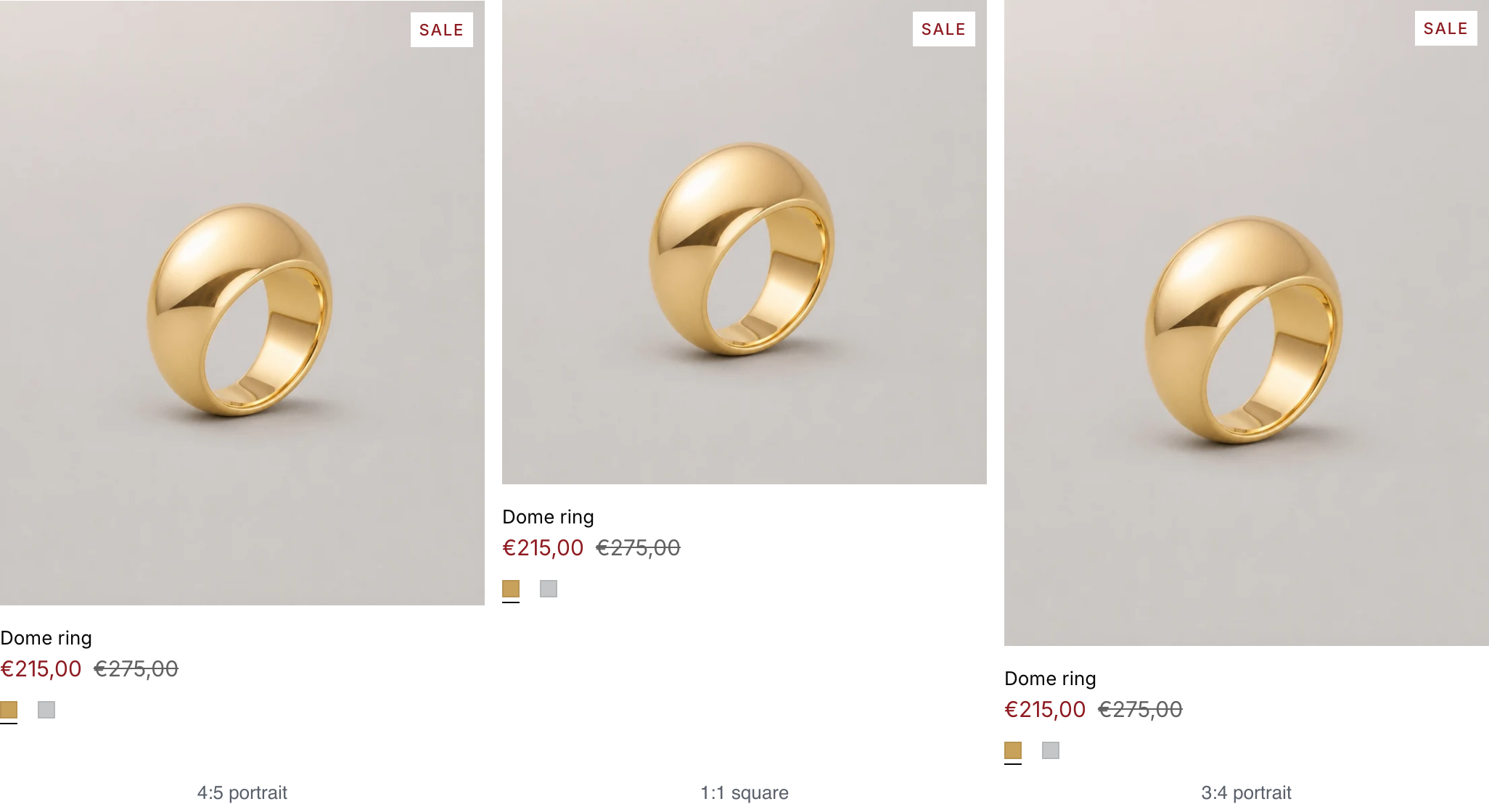
Image aspect ratio: the shape of every card image. Installs as 4:5 portrait. Adapt to image keeps each photo's own shape.
| Setting | What it does |
|---|---|
| Show price on the image | With Name inside the image: shows the price on the photo. Installs on. |
| Show price and swatches | With Name inside the image, on desktop: On hover or Always. Installs as Always. Phones always show them. |
| Show photo arrows | With Gallery or Follow the mouse, on desktop: On hover or Always. |
| Image progress line | With Gallery or Follow the mouse: the color of the line under the image showing which photo is in view. |
| Text alignment | Left or Center. Also lines up the name inside the image. |
| Show vendor | Shows the product's vendor. Installs off. |
| Show color swatches | A swatch for each value of the first option that has swatches, such as Metal, up to 6. Swatches come from Shopify's option swatches or from metal and color names. On phones, cards with the name inside the image hide them. Installs on. |
| Show star rating | Stars and the review count under the price, from your reviews app. Shows only on products with reviews; other cards don't change. Installs on. See Star ratings from a reviews app. |
| Open on the matching variant | On collection and search pages, the card opens on the variant matching the filters in use, or the metal the collection is named after, with its photos and price. Installs on. |
| Preview swatch photos on hover | On desktop, hovering a swatch shows that variant's photo. Installs on. |
Badges
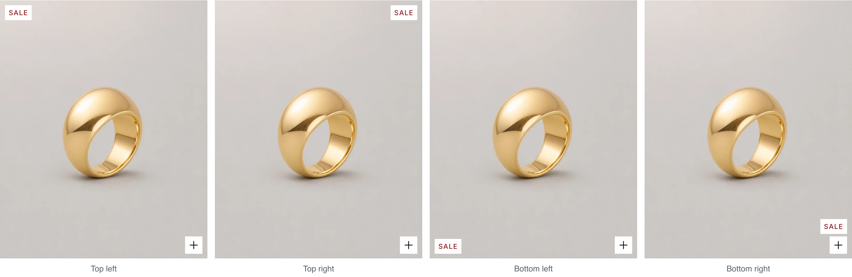
Position on product cards: the corner for Sale, Sold out, New and Last pieces. Installs as Top right. In the quick add button's corner, badges sit above the button. With Name inside the image, bottom badges move to the top.
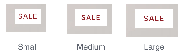
Badge size: on product cards and the product page. Installs as Small.
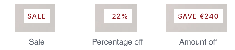
Wording: what the sale badge says. Uses the largest saving among the variants.
Metafield badge style: how a metafield badge looks beside the others. Setting one up is under Good to know.
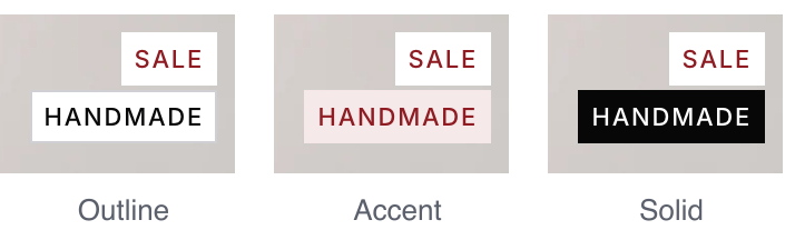
| Setting | What it does |
|---|---|
| Show sale badge | On products with a compare-at price above the price. |
| Show sold out badge | On products with no variant in stock. |
| Show new and last pieces badges | New for products tagged new, Last pieces for products tagged last-pieces. |
| Background and Text | Each badge type's colors. |
| Badge metafield | A product metafield to show as a badge, written as namespace.key. Empty on install. |
| Metafield badge position | With the other badges, or its own corner so it stays clear of them. |
| Show on product page | Also shows the metafield badge on the product page. |
| Position on product page | On the image or Under the title. Also used in quick view and the featured product section. |
Good to know#
How do I add a metafield badge, such as "Handmade"?
- In Settings > Metafields and metaobjects > Products (opens Shopify admin in a new tab), add a product metafield such as
custom.badge(single line text). - On each product, type the badge in it, such as
Handmade. - In Theme settings > Badges > Badge metafield, enter
custom.badge.
| You type on the product | Shoppers see on the card |
|---|---|
Handmade in custom.badge |
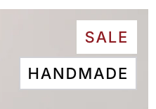 |
A list metafield shows up to 3 badges. Types and metaobject badge colors: Metafields the theme reads.
Why don't my cards show star ratings?
The stars come from your reviews app, such as Judge.me, Loox, Okendo, Yotpo or Stamped, through Shopify's standard review fields. A product shows them once it has at least one review and the app has synced its rating. Check that Show star rating is on. Setup and the product page block: Star ratings from a reviews app.
Why does a card show only one badge?
A card shows one of Sale, Sold out, New and Last pieces at a time. Sold out comes first, then Sale, then New, then Last pieces. A metafield badge shows alongside.
Why does the card show the same photo for Worn and Still?
Still is the product's first image and Worn the second. Add a second photo of the piece being worn, or reorder the product's media.