

Mega menus
Style the desktop panel of a top-level menu item in Kera with columns, collection images, product previews or your own image cards.
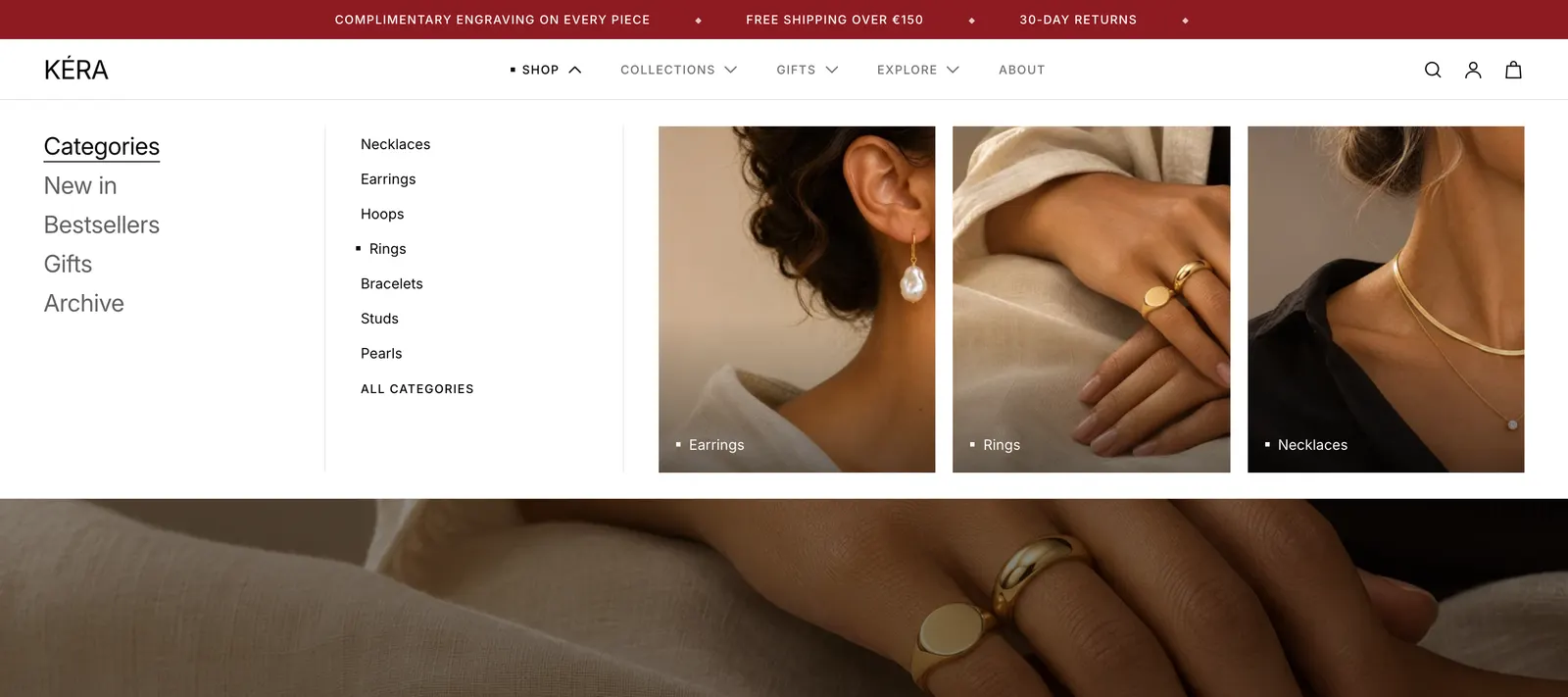
On desktop, a top-level menu item with nested links opens a panel showing its links with images. A Mega menu block changes one item's panel: its layout, its images, and cards you choose.
Set it up#
- In Online Store > Navigation (opens Shopify admin in a new tab), nest links under the top-level item, such as Shop > Rings, Earrings. Link to collections where you can.
- In the editor, open Header > Desktop, click Add block and choose Mega menu, Mega menu with cards or Compact mega menu.
- In Menu item, type the top-level item's name, such as
Shop. Case, accents, punctuation and[labels]don't matter. - Choose the Layout and Images.
- For your own cards, set Images to Your cards and add Card blocks inside the Mega menu block.
Do it with Sidekick
Open Sidekick in the theme editor and paste this, with your own names. Check the preview, then click Save.
In the header's Desktop area, add a Mega menu block for the menu item "Gifts", with Layout set to Cards and Images set to Follow the pointer.
Settings#
Mega menu block
| Setting | What it does |
|---|---|
| Menu item | The top-level main menu link this block styles, for example Shop. |
| Layout | Automatic: columns when the item has third-level links, cards otherwise. Columns: links on the left, details and images beside them. Cards: one image card per link. Compact list: a short list with no images. Installs as Automatic. |
| Images | Follow the pointer: images of the link the shopper points at, up to 3, or a collection's image plus its products. Your cards: your Card blocks. No images: links only. Hidden for Compact list. |
| Products next to a collection | With Follow the pointer: 0 to 3 products beside a collection's image. Default 2. |
| Card shape | With Your cards: Portrait, Square or Landscape. |
| Cards position | With Your cards and columns: Right or Left of the columns. |
Card block
| Setting | What it does |
|---|---|
| Collection | Shows the collection's image and name, and links to it. The collection's real size metafield shows on hover. |
| Product | Shows the product's image, name and price, and links to it. |
| Image | Your own image. Replaces the collection or product image. |
| Heading | Replaces the collection or product name. |
| Caption | A short line under the heading, such as Up to 30% off. Product cards show their price when this is empty. |
| Link | Replaces the collection or product link. |
Good to know#
How do menu levels become a panel?
The top level (Shop) opens the panel; the second level (Rings) is its links. When any second-level link has links of its own (Gold rings), the panel shows columns: the first lists the second-level links, and pointing at one shows its links beside it. With Your cards or No images, a collection link without links of its own lists up to 5 of its products and an "All" link.
My Mega menu block doesn't change anything.
Menu item doesn't match a top-level link in the header's Menu. In the editor preview on desktop, a note above the panels lists the names you can use. The note never shows on the store. When two blocks name the same item, the lower one in the sidebar wins.
Can an item without nested links open a panel?
Yes. Add a Mega menu block for it, such as Gifts linking to a page, set Images to Your cards, and add Card blocks. On phones, the item stays a plain link.