

Mobile menu
Set up Kera's phone menu as an accordion or tabs, show collection images or your own cards per item, and add a promo card.
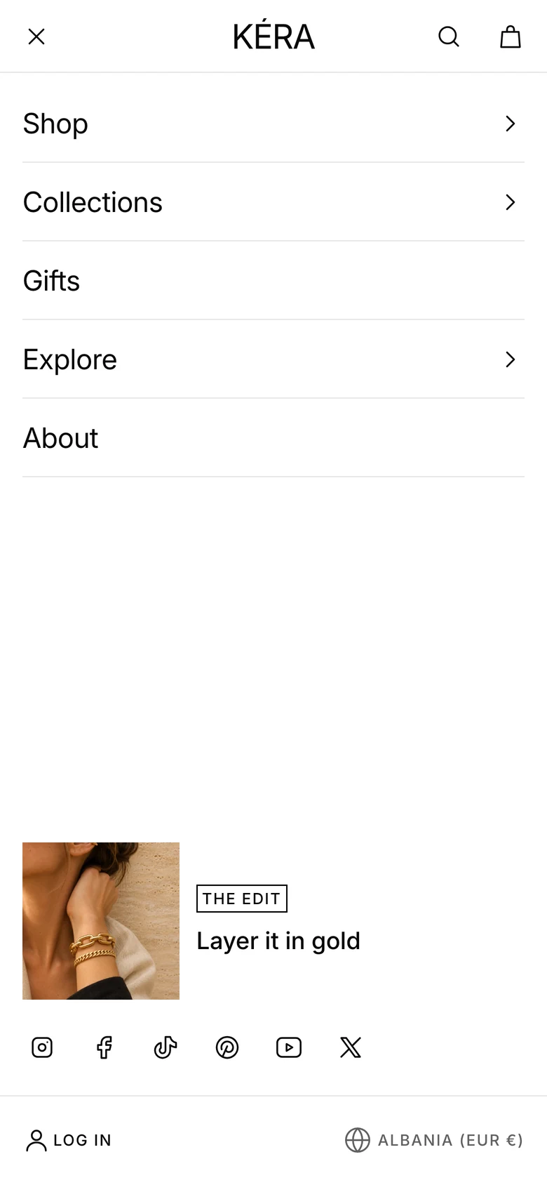
On phones, the menu button opens a full-screen menu built from the same Menu as desktop. The Mobile block sets how items open and what sits at the bottom; Mobile menu blocks change how one item looks.
Set it up#
- Open Header and select Mobile. The preview opens the mobile menu.
- Choose a Menu layout: Accordion or Tabs.
- Set the promo card's Image, Badge, Heading and Link, or clear Heading and Image to remove it.
- To change one item, click Add block, choose Mobile menu or Mobile menu with cards, and type the top-level item's name in Menu item, such as
Shop. - Choose Images. For Your image cards, add Card blocks inside it.
Settings#
Mobile block
| Setting | What it does |
|---|---|
| Menu layout | Accordion: items stack in one list and open right under themselves, all starting closed. Tabs: items with links sit in a tab row and one shows at a time, starting with the first; items without links are plain links in the row. Installs as Accordion. |
| Show social media icons | Icons at the bottom, from Theme settings > Social media. Installs on. |
| Show country and language | Selectors at the bottom, when the store sells in more than one country or language. Installs on. |
| Image | The promo card's image. |
| Badge | A short line on the promo card, such as Up to 20% off. |
| Heading | The promo card's heading. |
| Link | Where the promo card goes. Empty links to the home page. |
| Card color scheme | The promo card's colors. The same scheme as the menu shows the card without a box. |
Layout and Color scheme are on Header layouts and sticky header.
Mobile menu block
| Setting | What it does |
|---|---|
| Menu item | A top-level main menu link with nested links, for example Shop. Case, accents, punctuation and [labels] don't matter. |
| Images | Collection images: each link as a card with its collection's image. Your image cards: your Card blocks. None: a plain list of links. Installs as Collection images. |
| Card shape | With Your image cards: Portrait, Square or Landscape. |
| Cards heading | With Your image cards, on an item with groups: the heading above the cards. Default "Featured". |
| Cards layout | With Your image cards, on an item with groups: Carousel or Grid. |
Card blocks have the same settings as in a mega menu: Collection, Product, Image, Heading, Caption and Link. See Mega menus.
Good to know#
How is the menu built from my links?
Each top-level link is an item; links nested under it are what it opens to. Links one level deeper form a group that opens and closes, and each item's first group starts open. An item without nested links is a plain link. With Collection images, an item whose links have no links of their own shows them as image cards with each collection's image. With Your image cards, an item without groups shows your cards instead of its links; an item with groups keeps them and shows the cards underneath.
What's at the bottom of the menu?
The promo card (when it has a Heading or Image), social icons, Log in or Account when customer accounts are on, and the country and language selectors.
My Mobile menu block does nothing.
Menu item matches no item with nested links. The editor shows a note listing the names you can use; it never shows on the store. The header installs with a block set to Shop with three empty cards, which do nothing until your menu has a Shop item with nested links.