

Show sizes side by side with Size comparison
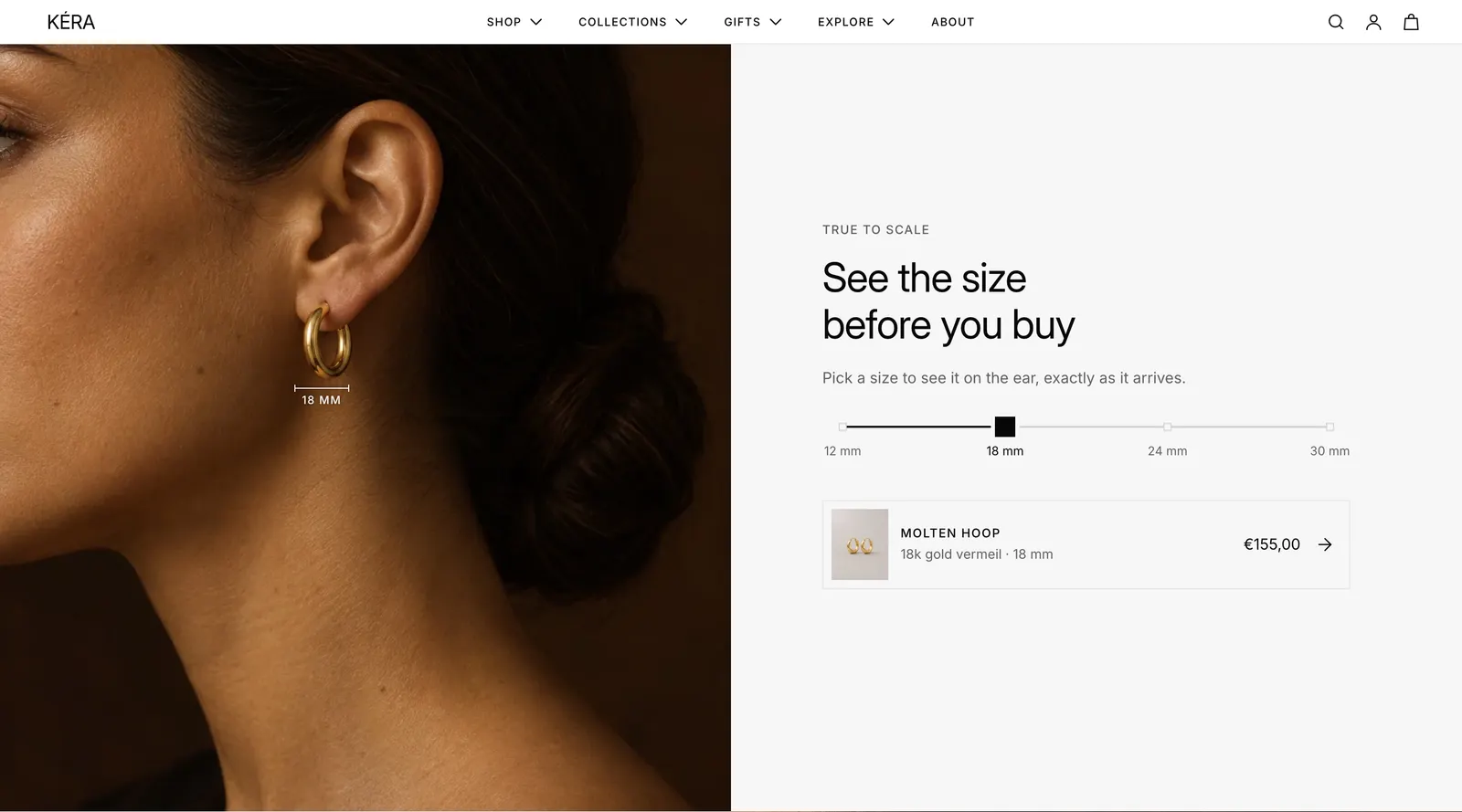
Add a section where shoppers slide between sizes in millimeters and see each size worn, with the matching product under it.
One photo per size, a track of sizes in millimeters, and the product for the size in view. Shoppers drag the track, tap a size, or swipe the photo, and a labeled measure line grows with the size.
Set it up#
The sizes come from blocks you set up in the section, or from each product's own data. Use the product's data on product templates, so every product shows its own sizes.
From blocks:
- Add the Size comparison section. It comes with four Size blocks (12, 18, 24 and 30 mm).
- In each Size block, set Size in mm, upload the Image of the piece worn at that size, and choose the Product. The product row opens the product at that size.
- Set Horizontal position and Vertical position so the measure line sits on the piece.
- Set Starting size to the size shown first.
From the product:
-
In Settings > Metafields and metaobjects (opens Shopify admin in a new tab), add a metaobject definition named Size preview with type
size_preview. Give it these fields:Field Key Type Label labelSingle line text, for your own reference Image imageFile (images) Size (mm) size_mmDecimal Measure line X (%) measure_line_xDecimal: the line's center, from the photo's left edge Measure line Y (%) measure_line_yDecimal: the line's top, from the photo's top edge, just under the piece Measure line width (%) measure_line_widthDecimal: the piece's width, as a share of the photo's width Turn on Storefronts API access.
-
Add a product metafield definition
custom.size_previews, type Metaobject, List of entries, pointing at Size preview. -
For each product, add one Size preview entry per size and list them in its Size previews metafield.
-
In the section, set Sizes to Product metafield. On a product template, leave Product empty to use the page's product.
Settings#
Section settings
| Setting | What it does |
|---|---|
| Color scheme | Colors of the section. Default scheme 2. |
| Eyebrow | Small text above the heading. Default "True to scale". |
| Heading | The section heading. Line breaks are kept. |
| Heading size | Extra large, Large, Medium (default), Small or Extra small. |
| Text | A short paragraph under the heading. |
| Sizes | Set in blocks (default) or Product metafield: the product's Size previews. |
| Product | With Product metafield: the product whose sizes show. Leave empty on product templates to use the page's product. |
| Size option name | With Product metafield: the option that holds the sizes. Default "Size". |
| Photo note | With Product metafield: a short line under the product row, for example "Shown in yellow gold." |
| Starting size | The size shown first, in mm. 2 to 100, default 18. If no block has that size, the first block shows first. |
| Top spacing | None (default), Small, Medium or Large. |
| Bottom spacing | None (default), Small, Medium or Large. |
Size block settings (up to 16 sizes)
| Setting | What it does |
|---|---|
| Tab | Groups sizes into tracks. Default "Ear". |
| Size | The size in mm, 2 to 100. Default 18. |
| Image | The piece worn at this size. |
| Product | Its first image, name and price show in the row under the controls, and the row links to it. |
| Material | Text before the size in the product row, for example "Yellow gold". |
| Horizontal position | Where the measure line sits across the photo, 0 to 100%. Default 50%. |
| Vertical position | Where the measure line sits down the photo, 0 to 100%. Default 60%. |
| Different position on mobile | Turns on separate positions for phones, for when phones crop the photo and the line misses the piece. Installs off. |
| Horizontal position on mobile | The line's horizontal position on phones. |
| Vertical position on mobile | The line's vertical position on phones. |
Every setting: Size comparison reference.
Good to know#
How do I show hoops and studs separately?
Give blocks a Tab name. Sizes with the same name share a track, and two or more names add a row of tabs. Sizes are spaced by value on each track; block order sets the photo order.
Which sizes show with Product metafield?
A Size preview shows when the product sells its size: its Size (mm) matches the number in a value of the size option, such as 12 mm or 1.2 cm. An entry for a size the product doesn't sell is skipped. A product without a size option shows its entries as they are. An entry without Size (mm) shows its photo with no size or line, which suits a product sold in one size.
A product has only one size.
The slider still shows, with its handle resting on that size, so it doesn't change shape when you add more sizes later. With one size there is nothing to drag.
Does choosing a size change the product I'm buying?
On the product's own page, yes. Picking a size in the section selects it in the buy box and keeps the other options, such as the metal. Picking a size in the buy box moves the section to it, and the product row shows that variant's price. Elsewhere, the row opens the product at that size.
The section is missing on some product pages.
With Product metafield, the section hides on products that have no Size previews. In the theme editor, a note shows in its place.
My photos show one metal only.
Say so in Photo note, for example "Shown in yellow gold.", so shoppers looking at another metal aren't misled.
Why does a size have no price or link?
Its block has no Product. The size still shows, with the tab name and size only.