

Heroes and slideshows
Add a large opening section to a page, from a slideshow to a shoppable image banner, and set each one up in a few steps.
Six sections made to open a page. Dial and Text reveal are under Storytelling in the section list; the rest are under Banners.
| Section | What it's for |
|---|---|
| Slideshow | Up to 3 full-width slides that change on their own |
| Split hero | Two or three categories side by side, each a link |
| Switch hero | One piece in up to 4 views, such as still and worn |
| Image banner | A campaign image with dots that open product cards |
| Dial | Zodiac signs, seasons, birthstones or weekdays, starting on today's |
| Text reveal | A short brand statement that fills in as shoppers scroll |
New to the editor? See How the editor is organized. For a single video, see Video sections.
Do it with Sidekick
Open Sidekick in the theme editor and paste this, with your own names. Check the preview, then click Save.
Add an Image banner section to the home page under the Slideshow. Set the Heading to "The winter edit" and add Hotspot blocks for the products "Pearl drop earrings" and "Chain bracelet".
Slideshow#
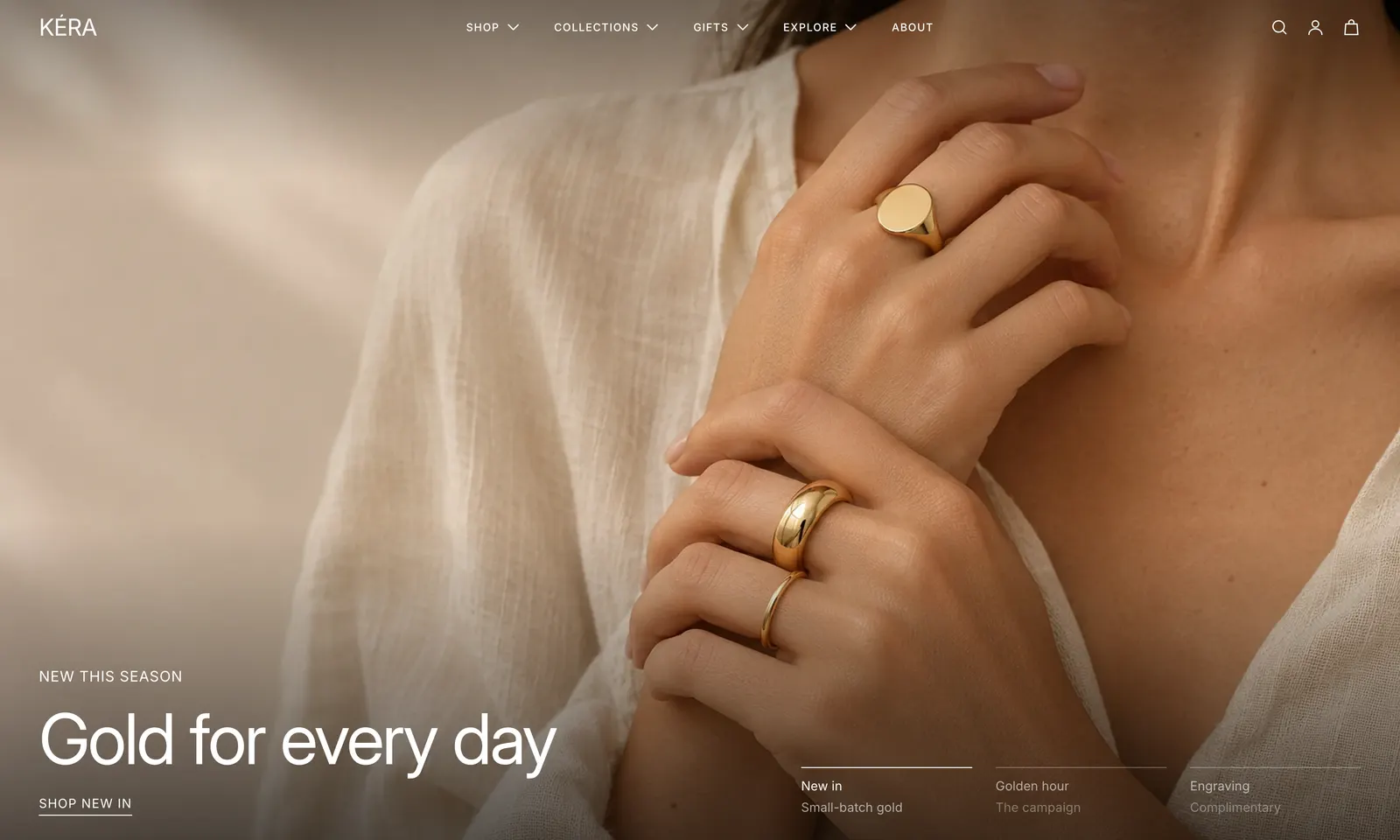
Full-width image or video slides that change on their own or from a row of tabs.
- Add a Slideshow section. It starts with 3 Image slide blocks.
- In each slide, choose an Image and set the Button label and Button link.
- Choose a Text color that reads on the image.
- For a video, click Add block > Video slide. Up to 3 slides in all.
Slideshow settings
| Setting | What it does |
|---|---|
| Change slides automatically | Slides move on after Seconds per slide, 3 to 10. |
| Mobile image | On a slide: a portrait crop for phones. |
| Text color | On a slide: Light, for dark images or Dark, for light images. |
| Slide tab heading | On a slide: its name in the tab row. Empty shows "1 of 3" and so on. |
| Poster image | On a video slide: shows until the video plays. |
The tab row shows with 2 or more slides. A slide without an image shows a placeholder. Every setting: Slideshow reference
Split hero#
Two or three panels side by side, each with an image or video, a heading and a link.
- Add a Split hero section. It starts with a Video panel and an Image panel.
- In each panel, choose a Video or an Image.
- Set the Link label and Link. The whole panel links there.
- For a third panel, click Add block > Image or Video.
Split hero settings
| Setting | What it does |
|---|---|
| Layout on mobile | Stacked or Side by side. |
| Mobile image | On a panel: a crop for phones. Video panels have Mobile video. |
| Focus | On a panel: the part of a wide image kept in view: Focal point, Left or Right. |
| Text color on phones | On an image panel: for a phone image lighter or darker than the main one. |
Videos play muted on a loop. Visitors who prefer reduced motion see the preview image. Every setting: Split hero reference
Switch hero#
One product in up to 4 views, such as still and worn. Shoppers switch views with a toggle, the arrow keys or a swipe.
- Add a Switch hero section. It starts with two View blocks.
- Choose a Product. Views without their own image use its images in order.
- In each view, set the Toggle label and choose Text on this photo: Light or Dark.
- Set the Button label and Second link label.
Switch hero settings
| Setting | What it does |
|---|---|
| Product | Supplies images to views without one, and is where the button and second link go when theirs is empty. |
| Show caption | A caption with the piece's name, option and price. |
| Caption heading | Empty uses the product name. Each view can set its own. |
| Mobile image | On a view: shown on phones instead. |
A view with no image and no product image shows a placeholder. Every setting: Switch hero reference
Image banner#
One large image with text, two links and up to 6 hotspots: dots that open a small product card.
- Add an Image banner section. It starts with two Hotspot blocks.
- Choose an Image, then set the link labels and links.
- In each hotspot, choose a Product. Move the dot onto the piece with Horizontal position and Vertical position, 0 to 100%.
- For more pieces, click Add block > Hotspot.
Image banner settings
| Setting | What it does |
|---|---|
| Pin behind the next section | The next section slides over the banner as the page scrolls, on tablets and desktop. |
| Text on mobile | On the image, or Below the image to show the whole image uncropped. |
| Mobile crop | The part of a wide image kept in view on phones. |
| Show the card at first | On a hotspot: opens its card when the page loads. Only the first one with this on opens. |
| Set a different position on mobile | On a hotspot: a second position for phones, for a Mobile image or a crop that moves the piece. |
Every setting: Image banner reference
Dial#
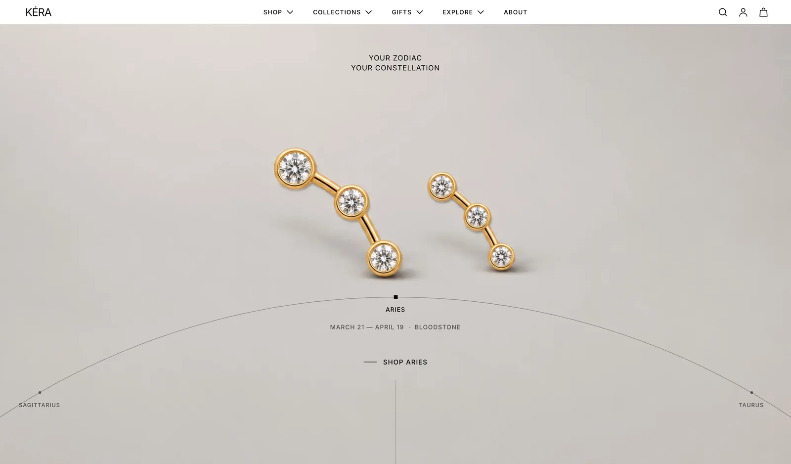
A full-screen photo per item, with the items on an arc below, for anything in a cycle.
- Add Dial: zodiac, Dial: seasons, Dial: birthstones or Dial: days of the week. Each comes with its items and dates.
- In each Item, choose an Image and set the Link label and Link.
- For your own cycle, click Add block > Item and set the Name and dates or Weekday. Up to 24.
- Choose what the dial should Start on.
Dial settings
| Setting | What it does |
|---|---|
| Start on | Today's item or A chosen item. With no match for today, it starts on the chosen item. |
| Today's item is the one whose | Dates include today or Weekday is today, on the visitor's own date. |
| Spacing between items | 10 to 45°. |
| Photo overlay | 0 to 60%. Darkens the photo. |
| Turn on its own | Moves on after Time on each item, 3 to 12 seconds. |
Shoppers turn the dial by tapping a name, dragging, swiping or with the arrow keys. Every setting: Dial reference
Text reveal#
A short statement whose words fill in as the shopper scrolls. It works well right after an image hero.
- Add a Text reveal section.
- Write a sentence or two in Text.
- Optional: set a Link label and Link, such as to your about page.
Text reveal settings
| Setting | What it does |
|---|---|
| Text size | Large, Medium or Small. |
| Reveal start point | Where on the screen the reveal begins: 50 to 100%. |
| Finish revealing at | Where it ends: 20 to 60%. |
Visitors who prefer reduced motion see all the text at once. Every setting: Text reveal reference
Good to know#
How do I put the header over the hero?
In the Header section, turn on Transparent on home page or Transparent on about page, and choose Light or Dark for Text and icons. The first section must be a Slideshow, Split hero, Switch hero, Image banner or Dial, or a Video feature with Full width on, with Top spacing set to None. See Header layouts and sticky header.