

Editorial sections
Add text, image and story sections for About pages, brand stories and promotions, and set each one up in a few steps.
Sections that tell your story around the products: who you are, how pieces are made, and what's on now. Customer quotes are in Newsletter, popup and reviews.
| Section | What it's for |
|---|---|
| Rich text | A short band of text with a button, such as an intro |
| Image with text | An image beside text, facts or feature icons |
| Marquee | A line of short phrases that scrolls across the page |
| Quote with image | A founder's quote beside a photo |
| Logo list | Press or partner logos |
| Stats | Large figures, such as the year you started |
| Timeline | Your brand's story, year by year |
| Process index | How your pieces are made, step by step |
| Portrait grid | Photos of your makers or of pieces worn |
| Services | Services such as gift wrapping, repairs or shipping |
| FAQ | Questions that open in place |
| Call to action band | A short message with a link and a button |
| Countdown | A countdown to the end of a sale or a launch |
| Icons with text | Short promises, such as delivery and returns |
New to the editor? See How the editor is organized. New sections start with sample text, and shoppers see it, so replace it before you publish.
Do it with Sidekick
Open Sidekick in the theme editor and paste this, with your own words. Check the preview, then click Save.
In the Stats section on the about page, set the four Figure blocks to "2016" Year founded, "12" Makers, "100%" Recycled gold, "4" Studios.
Rich text#
A text band built from Eyebrow, Heading, Text and Button blocks, in any order.
- Add a Rich text section. It starts with one block of each kind.
- Replace each block's text. Hide the ones you don't need with the eye icon.
- In the Button block, set a Label and a Link.
- Choose an Alignment.
Rich text settings
| Setting | What it does |
|---|---|
| Alignment | Left, Center, or Text left, button right. |
| Size | Heading and Text blocks: the text size. |
| Style | Button block: Primary, Secondary, Text link or Line. |
A button shows only with both a Label and a Link. Can also go in the footer group. Every setting: Rich text reference
Image with text#
An image on one side and text blocks on the other, for your materials, process or team.
- Add an Image with text section.
- Choose an Image, and set the Image ratio and Image position on desktop.
- Replace the text blocks' text, and hide the ones you don't need.
- Optional: click Add block > Facts or Features for key figures or feature icons.
Image with text settings
| Setting | What it does |
|---|---|
| Image to the edge of the screen | Runs the image to the edge of the screen. |
| Muted color | Text block: shows the text in a softer color. |
| Label 1 | Facts block: up to 3 facts, each a label and a value. A fact shows only with both. |
| Icon | Feature block: an icon in a thin ring. |
On phones, the image sits above the text. Fill in or hide the sample facts and features. Every setting: Image with text reference
Marquee#
A line of up to 8 short phrases that scrolls across the page, each with an optional icon.
- Add a Marquee section. It starts with four Item blocks.
- In each item, replace the Text. Optional: choose an Icon.
- For more, click Add block > Item.
Marquee settings
| Setting | What it does |
|---|---|
| Text size | Body large, Heading 4 or Heading 3. |
| Seconds per loop | 20 to 120. Higher is slower. |
It pauses when pointed at and has a pause button. Can also go in the footer group. Every setting: Marquee reference
Quote with image#
A founder's quote with a name, a role, an optional link and a captioned photo.
- Add a Quote with image section.
- Replace the Quote, Name and Role.
- Choose an Image and write a Caption, or clear it.
Quote with image settings
| Setting | What it does |
|---|---|
| Intro line | A short line under the eyebrow. |
| Quote | Type the quotation marks yourself. |
| Quote size | Large, Medium or Small. |
| Link label | The link shows only with both a label and a Link. |
| Image position on desktop | Right or Left. |
The sample "Name", "Role" and "Add a caption" show to shoppers until you replace them. Every setting: Quote with image reference
Logo list#
Up to 16 press or partner logos in a slow loop or a still row.
- Add a Logo list section. It starts with six Logo blocks.
- In each block, choose a Logo image and type the Brand name.
- Remove the logos you don't need, and choose a Layout.
Logo list settings
| Setting | What it does |
|---|---|
| Layout | Marquee scrolls the logos. Static row keeps them still. |
| Seconds per loop | Marquee: 10 to 120. Higher is slower. |
| Logo height | 16 to 80 pixels. |
| Show logos in one gray tone | Logos show in full color on hover. |
| Logo image | On a block: a .png or .svg with a transparent background works best. |
A logo with no image and no brand name shows a placeholder. Can also go in the footer group. Every setting: Logo list reference
Stats#
Up to 8 large figures, each with a label, such as "2016, Year founded".
- Add a Stats section. It starts with four Figure blocks.
- In each block, replace the Figure and Label.
- For more, click Add block > Figure.
Stats settings
| Setting | What it does |
|---|---|
| Columns on desktop | 2 to 4. |
| Columns on mobile | 1 or 2. |
| Figure | On a block: a year, number or short value, like 2016 or 100%. Keep it short. |
Every setting: Stats reference
Timeline#
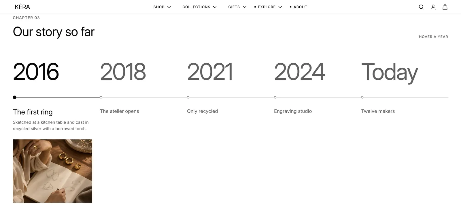
Up to 8 years on a line. Pointing at or tapping a year opens its heading, text and photo.
- Add a Timeline section. It starts with five Year blocks.
- In each block, replace the Year, Heading and Text, and choose an Image.
- For more, click Add block > Year. Drag the years into order.
Timeline settings
| Setting | What it does |
|---|---|
| Hint | Shown on the right on desktop, such as "Hover a year". |
| Year | On a block: a year or a short label, like Today. |
| Image | On a block: landscape, 5:4. Empty shows no photo. |
On phones, the years scroll sideways and the year a swipe stops on opens. Every setting: Timeline reference
Process index#
Up to 8 numbered steps, each with a heading, text, photo and optional link.
- Add a Process index section. It starts with four Step blocks.
- In each block, replace the Heading and Text, and choose an Image.
- For more, click Add block > Step. Drag the steps into order.
Process index settings
| Setting | What it does |
|---|---|
| Text | An intro line beside the steps. |
| Show line above | A thin line above the section's content. |
| Image | On a step: portrait, 4:5. |
| Link | On a step: the whole row links there and shows an arrow. |
On desktop, pointing at a step shows its text and photo beside the list. On phones, every step shows them. Every setting: Process index reference
Portrait grid#
Up to 12 captioned photos in a grid, for your makers or for pieces worn.
- Add a Portrait grid section. It starts with four Photo blocks.
- In each block, choose an Image and write a Caption.
- For more, click Add block > Photo.
- Set the columns and Mobile layout.
Portrait grid settings
| Setting | What it does |
|---|---|
| Columns on desktop | 2 to 5. |
| Mobile layout | Grid, or Carousel: one row that swipes sideways. |
| Image ratio | Portrait, Tall or Square. Photos are cropped to it. |
| Black and white photos | Photos turn to color when pointed at. |
| Label | On a block: small capitals above the caption. |
The sample captions show to shoppers until you replace them. Every setting: Portrait grid reference
Services#
Up to 3 tiles side by side. An image tile has a photo, text and a link; a list tile has up to 4 rows of links.
- Add a Services section. It starts with an Image tile and a List tile.
- In the image tile, choose an Image, replace the text, and set a Link.
- In the list tile, replace the Heading and rows, and set a link for each row.
Services settings
| Setting | What it does |
|---|---|
| Link label | Image tile: the link shows only with both a label and a Link. |
| Row 1 label | List tile: the row's name. Rows 2 to 4 work the same. A row shows only with a label. |
| Row 1 detail | List tile: a short line beside the label. |
| Row 1 link | List tile: a row with a link shows an arrow. |
On phones, the tiles stack. Every setting: Services reference
FAQ#
Questions that open in place. See FAQ page to set it up.
Call to action band#
An eyebrow, heading and text on one side, and a text link and a button on the other.
- Add a Call to action band section.
- Replace the Text.
- Set a Text link label and Text link, and a Button label and Button link.
Call to action band settings
| Setting | What it does |
|---|---|
| Text link label | The link shows only with both a label and a Text link. |
| Button label | The button shows only with both a label and a Button link. |
Can also go in the footer group. Every setting: Call to action band reference
Countdown#
A timer to an end date. Every visitor sees the same end moment, and it never restarts.
- Add a Countdown section and choose a Layout.
- Type the End date as YYYY-MM-DD and the End time as HH:MM.
- Choose what happens When the countdown ends.
- Set a Button label and Link.
Countdown settings
| Setting | What it does |
|---|---|
| Layout | Bar, Image with text or Banner. |
| End date | For example 2026-12-31, in your store's time zone. |
| End time | 24-hour clock, such as 18:00. Empty means 00:00. |
| When the countdown ends | Hide section, or Show a message with the Message you type. |
Can also go in the header and footer groups, for example as a bar above the header. Every setting: Countdown reference
Icons with text#
Up to 6 short promises with icons, such as delivery and returns. Installs in the footer group, so it shows on every page.
- Click Icons with text in the footer area of the sidebar, or add a new one.
- In each item, choose an Icon or a Custom icon, and replace the Heading and Text.
- For more, click Add block > Item.
Icons with text settings
| Setting | What it does |
|---|---|
| Layout | Icon above text or Icon beside text. |
| Layout on mobile | Stacked, or Carousel with 2 or more items. |
| Custom icon | On an item: replaces the icon. Use a square image. |
| Link label | On an item: without it, the heading is the link. |
Every setting: Icons with text reference