

Collection and product sections
Add sections that lead shoppers to your collections and products, and set each one up in a few steps.
Nine sections show your collections or products on any page. Their product cards follow Product cards and badges.
| Section | What it's for |
|---|---|
| Collection tiles | A compact row of category shortcuts |
| Collection list | Large image cards for your main categories |
| Collection links | A typographic list of categories with a hover preview |
| Collection showcase | Up to 6 collections, told one at a time beside a large image |
| Collection tabs | New arrivals or bestsellers split into rings, earrings and more |
| Featured collection | One collection's products in a grid |
| Product tiles | The same grid with heading alignment, starting at 2 rows |
| Featured product | One product with a buy form, on any page |
| Shop by material | A card per material, such as a metal, linking to its collection |
New to the editor? See How the editor is organized.
Do it with Sidekick
Open Sidekick in the theme editor and paste this, with your own names. Check the preview, then click Save.
Add a Collection tabs section to the home page under the first section, with three Tab blocks for the collections "Rings", "Earrings" and "Necklaces". Set Products per tab to 8.
Collection tiles#

A row of small tiles, one per collection, for category shortcuts near the top of a page.
- Add a Collection tiles section. It starts with 8 Tile blocks.
- In each tile, choose a Collection. Click Add block > Tile for more, up to 16.
- Choose a Shape and how the Image fits the tile.
Collection tiles settings
| Setting | What it does |
|---|---|
| Tiles per row on desktop | 4 to 10. More tiles scroll with arrows. |
| Tiles in view on phones | 2.5, 3.5 or 4.5. The cut-off tile shows shoppers they can swipe. |
| Image | Fit with space for cut-outs on a plain background, Fill the tile for photos. |
| Tile background | The color behind each image. Transparent uses the color scheme. |
| Label | On a tile: replaces the collection title. |
A tile without a collection shows a placeholder. Every setting: Collection tiles reference
Collection list#
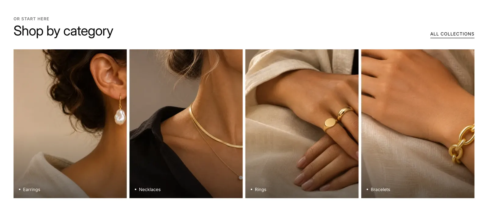
Image cards with each collection's name, plus a link to all collections.
- Add a Collection list section. With no blocks, it shows your store's collections.
- To choose the collections and their order, click Add block > Collection. Up to 12.
- Set Columns on desktop and Image ratio.
Collection list settings
| Setting | What it does |
|---|---|
| Rows | 1 to 3. How many collections show without blocks: rows × columns. |
| Columns on mobile | 1 or 2. With 2, a last card that would sit alone is left out. |
| Link label | The link to all collections. Empty hides it. |
| Image | On a block: replaces the collection image. |
Set each collection's image in Products > Collections (opens Shopify admin in a new tab) so the cards work without blocks. Every setting: Collection list reference
Collection links#
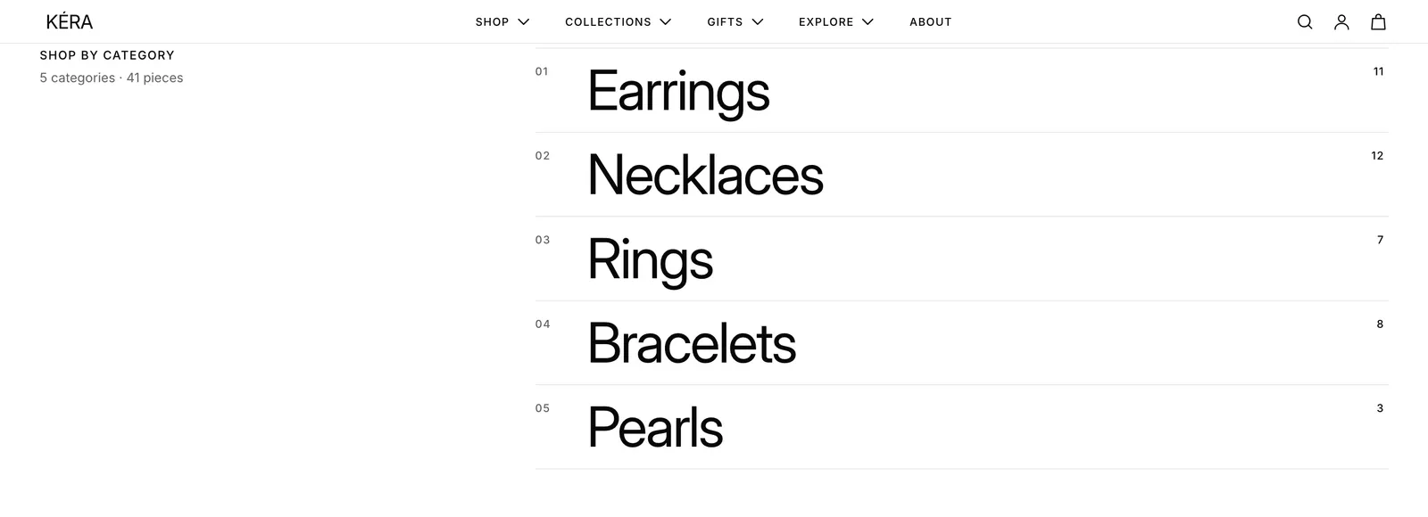
A list of collection names in large type, each with its product count and starting price. On desktop, hovering a name shows a preview image.
- Add a Collection links section. It starts with 4 Collection blocks.
- In each block, choose a Collection. Up to 8.
- Optional: set a Preview image to replace the collection image.
Collection links settings
| Setting | What it does |
|---|---|
| Show numbers | Numbers each row: 01, 02, 03. Off by default. |
| Show product count | A small number at the top right of each name. |
| Show starting price | From and the lowest price in the collection, at the end of the row. |
| Show arrow | An arrow at the end of each row, on desktop. |
| Hint | A short line inviting shoppers to hover. |
| Titles and preview image | Image over titles, Titles over image, or Titles over image, inverted for a white or black background. |
| Preview image | On a block: the image shown on hover. |
Phones and tablets show no preview. Every setting: Collection links reference
Collection showcase#
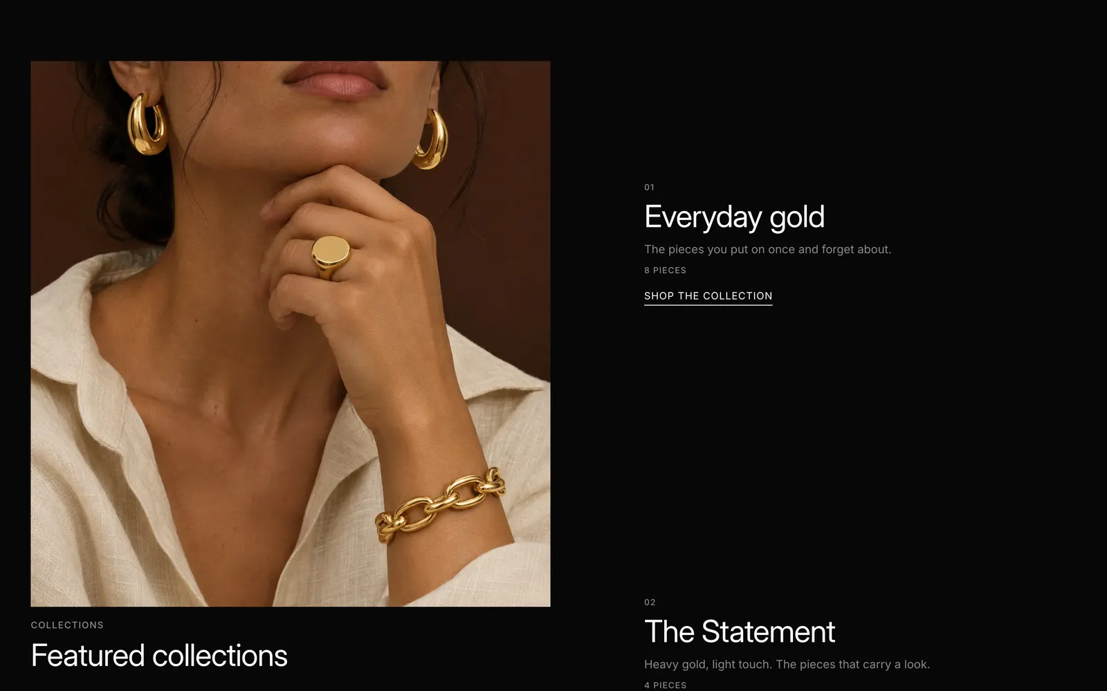
A large image stays in place while a numbered list of collections scrolls beside it.
- Add a Collection showcase section. It starts with 3 Collection blocks.
- In each block, choose a Collection. Up to 6.
- Check each block's Text and Image. Empty fields use the collection's description and image.
Collection showcase settings
| Setting | What it does |
|---|---|
| Text | On a block: replaces the collection description. Keep it to a sentence or two. |
| Image | On a block: replaces the collection image. Portrait images of one shape work best. |
| Link label | On a block: the link to the collection. |
On phones and tablets, each collection shows its own image above its text. Every setting: Collection showcase reference
Collection tabs#
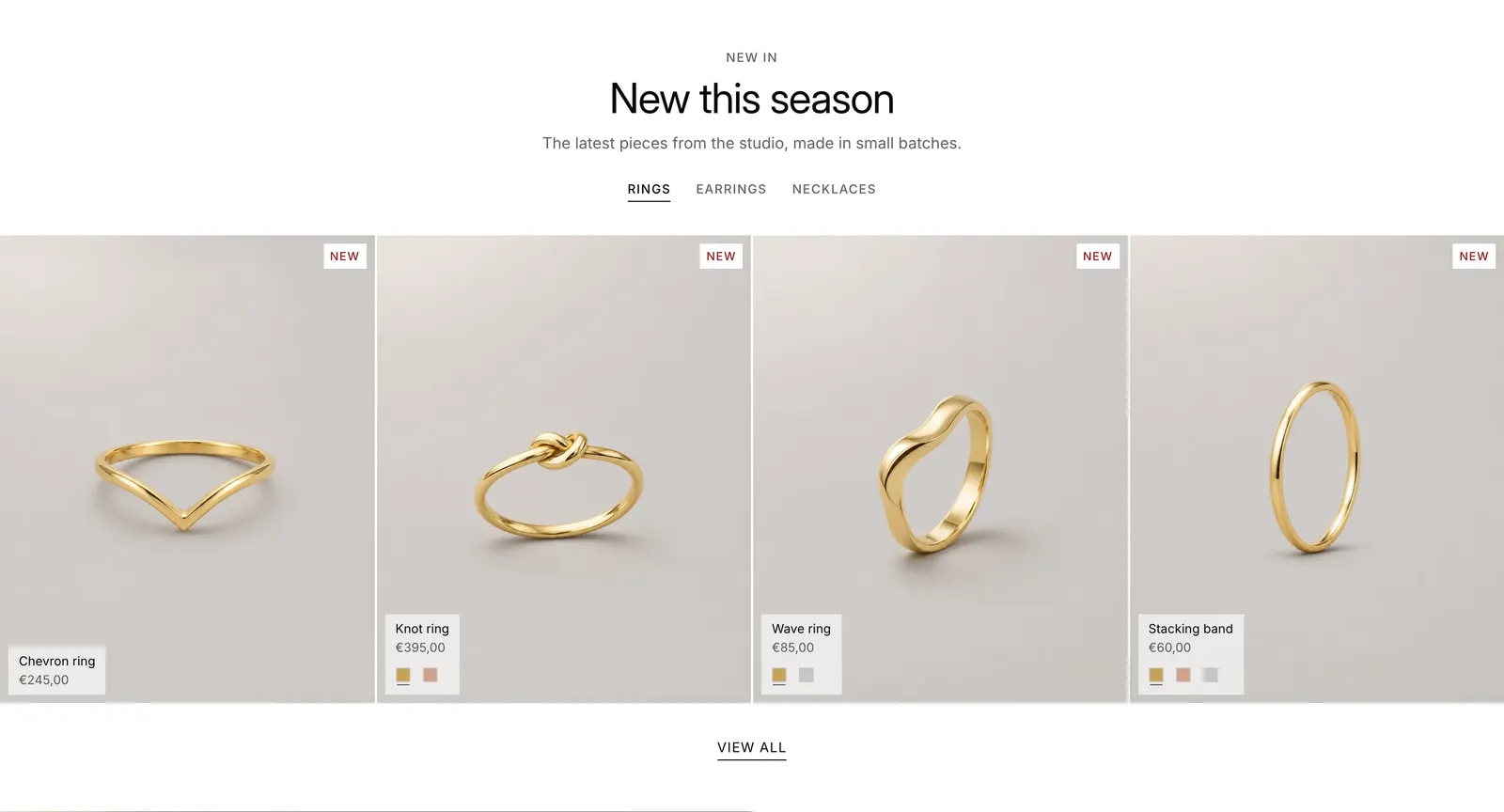
One tab per collection, each with a row of product cards shoppers can swipe.
- Add a Collection tabs section. It starts with 2 Tab blocks.
- In each tab, choose a Collection. Up to 4 tabs.
- Set Products per tab.
Collection tabs settings
| Setting | What it does |
|---|---|
| Products per tab | 4, 8 or 12, in the collection's sort order. |
| Show link to the collection | A link under the row to the open tab's collection. |
| Tab heading | On a tab: replaces the collection title. |
To change the order of products, sort the collection in Products > Collections (opens Shopify admin in a new tab). Every setting: Collection tabs reference
Featured collection#
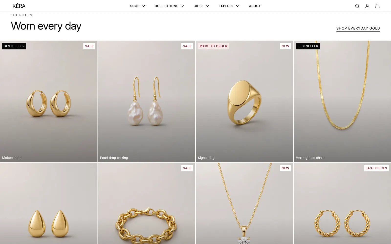
A grid of product cards from one collection, with a link to it.
- Add a Featured collection section.
- Choose a Collection.
- Set Rows, Columns on desktop and Columns on mobile.
Featured collection settings
| Setting | What it does |
|---|---|
| Rows | 1 to 4. |
| Columns on mobile | 1 or 2. With 2, a last product that would sit alone is left out. |
| Full bleed | Runs the grid edge to edge. With the Framed card style, cards share their hairlines. |
| Link label | The link to the collection. Shown when a collection is chosen. |
Every setting: Featured collection reference
Product tiles#
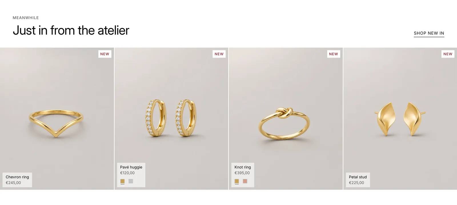
The same grid as Featured collection, with Heading alignment and 2 rows to start.
- Add a Product tiles section.
- Choose a Collection.
- Set Heading alignment, Rows and the columns.
Product tiles settings
| Setting | What it does |
|---|---|
| Heading alignment | Left, Center or Right. |
| Rows | 1 to 4. |
| Columns on mobile | 1 or 2. With 2, a last product that would sit alone is left out. |
| Link label | The link to the collection. |
Every setting: Product tiles reference
Featured product#
One product with its photos and a buy form. Choosing a variant updates the price, photos and button.
- Add a Featured product section.
- Choose a Product.
- Hide the blocks you don't need with the eye icon, and drag the rest to change their order.
Featured product settings
| Setting | What it does |
|---|---|
| Media position on desktop | Left or Right. |
| Style | Variant picker block: Buttons, Color circles, Variant images, Variant tiles, Squares or Dropdown. |
| Show quantity selector | Buy buttons block. |
| Text under the button | Buy buttons block: a short line, such as a delivery promise. |
The photo gallery uses the product page's settings: see Media gallery and full-screen viewer. Every setting: Featured product reference
Shop by material#
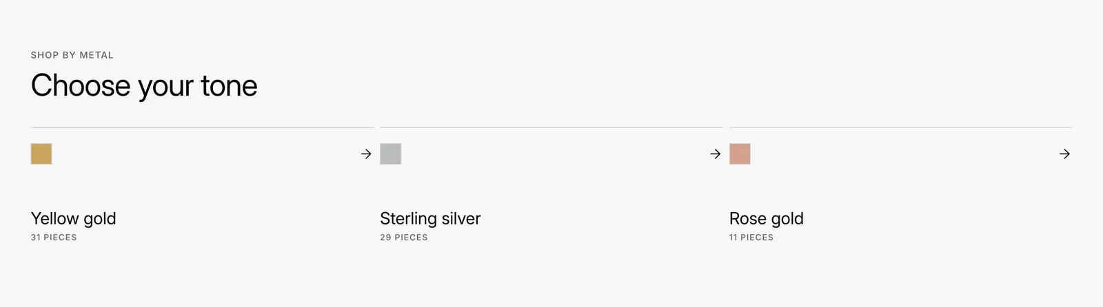
A card per material, such as each metal you sell, with a color swatch and a piece count, each linking to that material's collection.
- In Products > Collections (opens Shopify admin in a new tab), create a collection per material, such as an automated one with "Variant's title contains Yellow gold".
- Add a Shop by material section. It starts with 4 Material blocks.
- In each block, choose the material's Collection. Up to 6.
- Check each Name: the swatch takes the color of the metal or material it names.
Shop by material settings
| Setting | What it does |
|---|---|
| Show number of pieces | Counts the products in each material's collection. |
| Layout on mobile | Carousel swipes sideways. Grid shows two across. |
| Name | On a block: empty uses the collection title. |
| Swatch color | On a block: empty uses the theme's color for the material in Name. |
Every setting: Shop by material reference