

Set up the collection page and filters
Lay out the collection grid, add filters from Search & Discovery, and set up sorting, pagination and the sticky navigation bar.
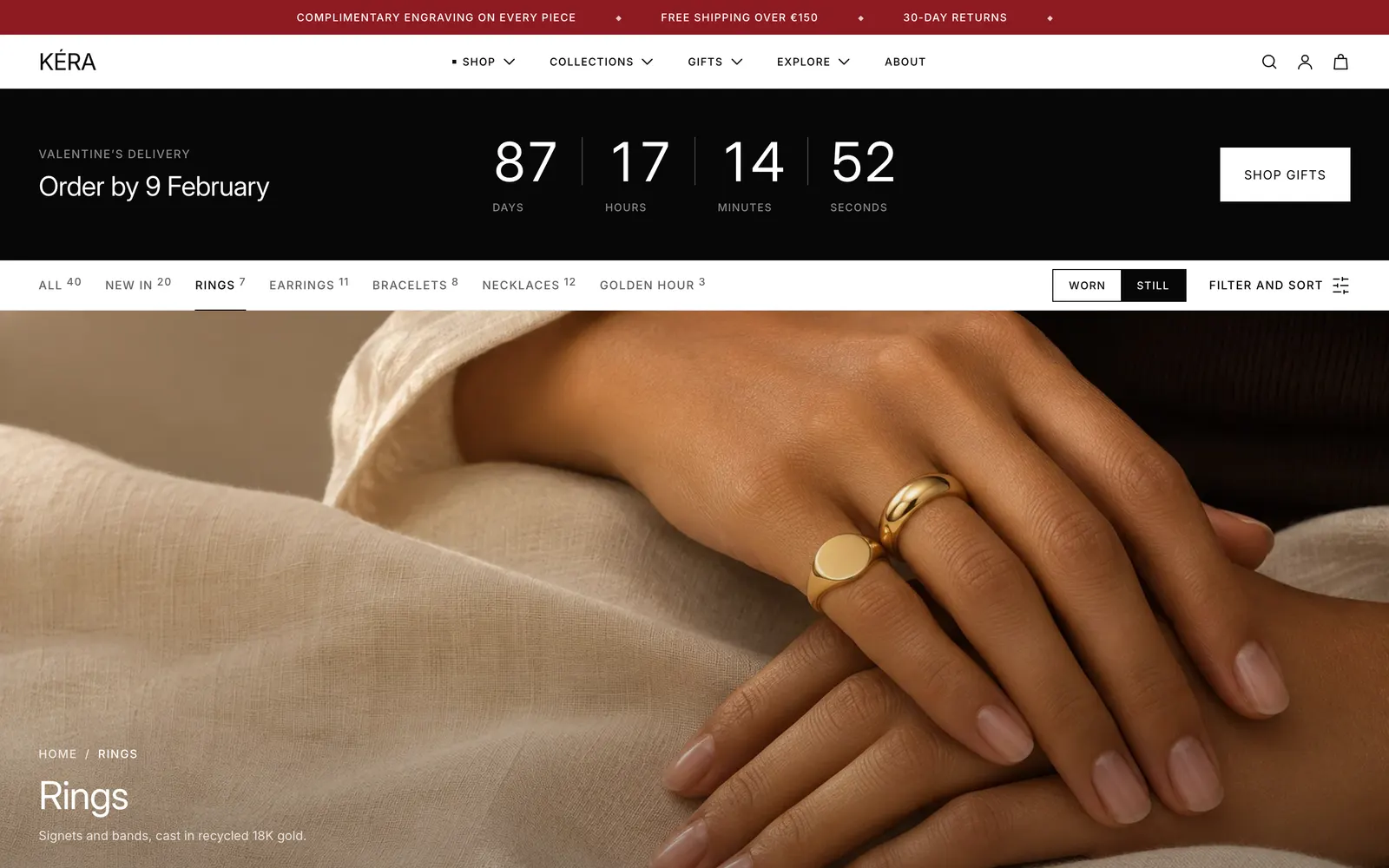
The Collection section builds every collection page: title and description, product grid, filters, sorting and paging. It holds three fixed blocks: Image, Filter and sort and Navigation bar.
Set it up#
- Select the Collection section. Set Columns on desktop, Columns on mobile, Products per page and Pagination.
- In Shopify admin, install the free Search & Discovery app. In its Filters page, click Add filter, choose a source (Availability, Price, Metal, Size, a metafield…) and drag filters into order.
- In Navigation bar, pick Collections for a row of links and turn on Sticky collection bar if you want it to stay on screen.
- In Image, choose a Width and where the title sits.
Settings#
Collection section settings
| Setting | What it does |
|---|---|
| Color scheme | Colors of the section. |
| Heading | Collection title (default) or Shop the edit, used under a Collection banner. |
| Show product count | Shows the count beside the title. Installs off. |
| Show collection description | Installs on. |
| Products per page | 8 to 48, default 24. |
| Pagination | Load more button (default) or Page numbers. |
| Show worn and still toggle | Installs on. |
| Columns on desktop | 3 or 4 (default). |
| Columns on mobile | 1 or 2 (default). |
| Show filters | Installs on. |
| Show sorting | Installs on. |
| Top spacing | None (default), Small, Medium or Large. |
| Bottom spacing | None, Small, Medium (default) or Large. |
The cards follow Theme settings > Product cards. See Product cards and badges.
Navigation bar block
Shows only when it has links, the Worn / Still toggle or Filter and sort. Collections and Show link to all products make the row of links; Show product counts adds counts. Position puts it Below image (the default) or Above image. Sticky collection bar keeps it under the header, or at the top of the window when the header doesn't stick. On phones, when the bar has collection links, the Worn / Still toggle moves out of it to just above the products. It has its own Color scheme; Background is Solid or Blurred (content shows through). For the toggle, see Worn / Still toggle.
Filter and sort block
Styles the Filter and sort button, in the navigation bar on larger screens and floating at the bottom on phones. Label replaces the automatic text (Filter and sort, Filter or Sort); Show icon turns the icon on or off. Turn on Own colors to fill it with a Color scheme on every screen size; off, it uses the bar's colors. Hide the block with the eye icon if you don't want filters or sorting on collection pages.
Image block
Show collection image uses the collection's image; Image is the fallback. Width: Page width, Full width or Full screen (fills the window, leaving room for the navigation bar). Image ratio (Original, 16:9, 21:9) doesn't apply to Full screen. Under Title and breadcrumbs, Position is Below the image or On the image, with Position on the image, Text color and Image shade. Breadcrumbs also need Theme settings > Layout > Show breadcrumbs.
Every setting: Collection reference.
Good to know#
How do filters look to shoppers?
Filter and sort opens a sheet. On phones its button floats at the bottom of the screen while the products are in view. The sheet comes up from the bottom on phones (swipe down to close), from the right on larger screens. The grid refreshes behind it, and the page address updates so a filtered page can be shared. Active filters show as chips with Clear all. Sheet colors: Theme settings > Drawers and overlays > Product and filter drawers.
Why do some filters show as chips or swatches?
Filters named with "size", "length" or "chain" show square chips. Values with swatches in Search & Discovery show swatches; without them, common metal names such as Yellow gold get a colored dot. Price shows From and To fields. Other filters are tick boxes.
Can cards show the variant that matches a filter?
Yes. Turn on Open on the matching variant in Theme settings > Product cards. With Metal: Sterling silver ticked, cards then show and link to the silver variant.
Where does the sort order come from?
With Show sorting on, sorting is the first group in the Filter and sort sheet. The options come from Shopify. The default is the collection's own order, set in Shopify admin under Products > Collections (opens Shopify admin in a new tab) > the collection > Sort.
The navigation bar doesn't stay on screen.
Turn on Sticky collection bar in the Navigation bar block. On phones only the collection links stick; the Worn / Still toggle stays above the products.