

Layout, buttons and spacing
Set Kera's page margins, section spacing, breadcrumbs, carousel arrows, button hover and price, corner shapes and motion.
Margins, section spacing, buttons and corners for the whole store, in four Theme settings groups: Layout, Buttons, Shapes and Animations.
Set it up#
- In Theme settings > Layout, choose Compact, Default or Roomy in Section spacing.
- Set Page margin and Page margin on mobile.
- In Buttons, pick the Hover effect and whether to show the price on Add to bag.
- In Shapes, pick the corners for buttons, fields, badges and card images.
- To change one gap only, select the section and change its Top spacing or Bottom spacing.
Settings#
Layout
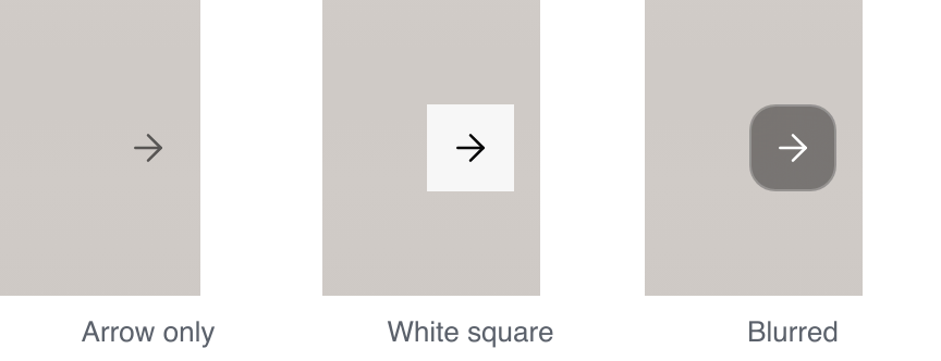
Carousel arrows: the arrows on product photos and carousels. Installs as White square.
| Setting | What it does |
|---|---|
| Show breadcrumbs | Home / Rings above page titles. Installs on. |
| Page margin | Left and right space on tablets and up. 16 to 80px, installs as 40px. |
| Page margin on mobile | The same on phones. 12 to 32px, installs as 16px. |
| Section spacing | How big Small, Medium and Large spacing are, below. |
| Section spacing | Small | Medium | Large |
|---|---|---|---|
| Compact | 16px | 32px | 48px |
| Default | 24px | 48px | 64px |
| Roomy | 32px | 64px | 96px |
Phones use about 70% of these.
Buttons
Hover effect: what Add to bag and other buttons do under the pointer. Installs as Wipe.
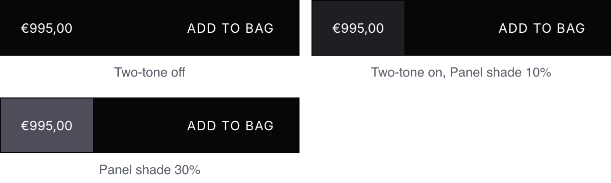
Two-tone price panel and Panel shade: the price sits on a panel one shade off the button. Installs off, shade 10% (2 to 30%).
| Setting | What it does |
|---|---|
| Show the price on the button | The price at the left of every Add to bag button, as above. Installs on. |
Button colors come from the color scheme: see Colors and color schemes.
Shapes
All four install as Square. The product gallery, drawers and full-width images stay square.
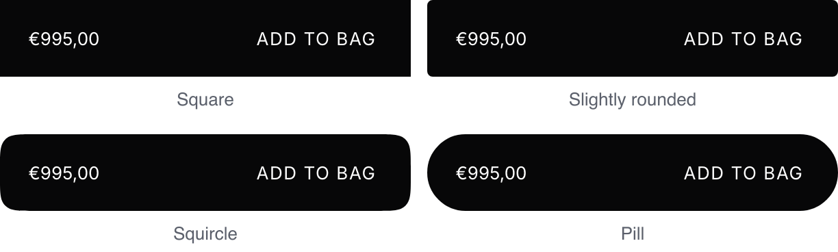
Buttons: also quantity and option buttons.
Fields and rows: also dropdowns and drawer rows.

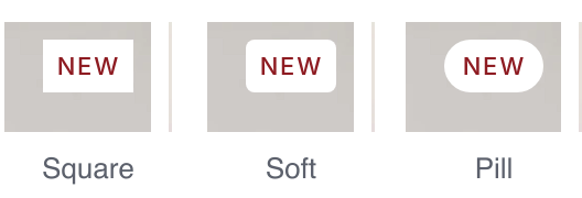
Badges: Sale, Sold out, New and labels.
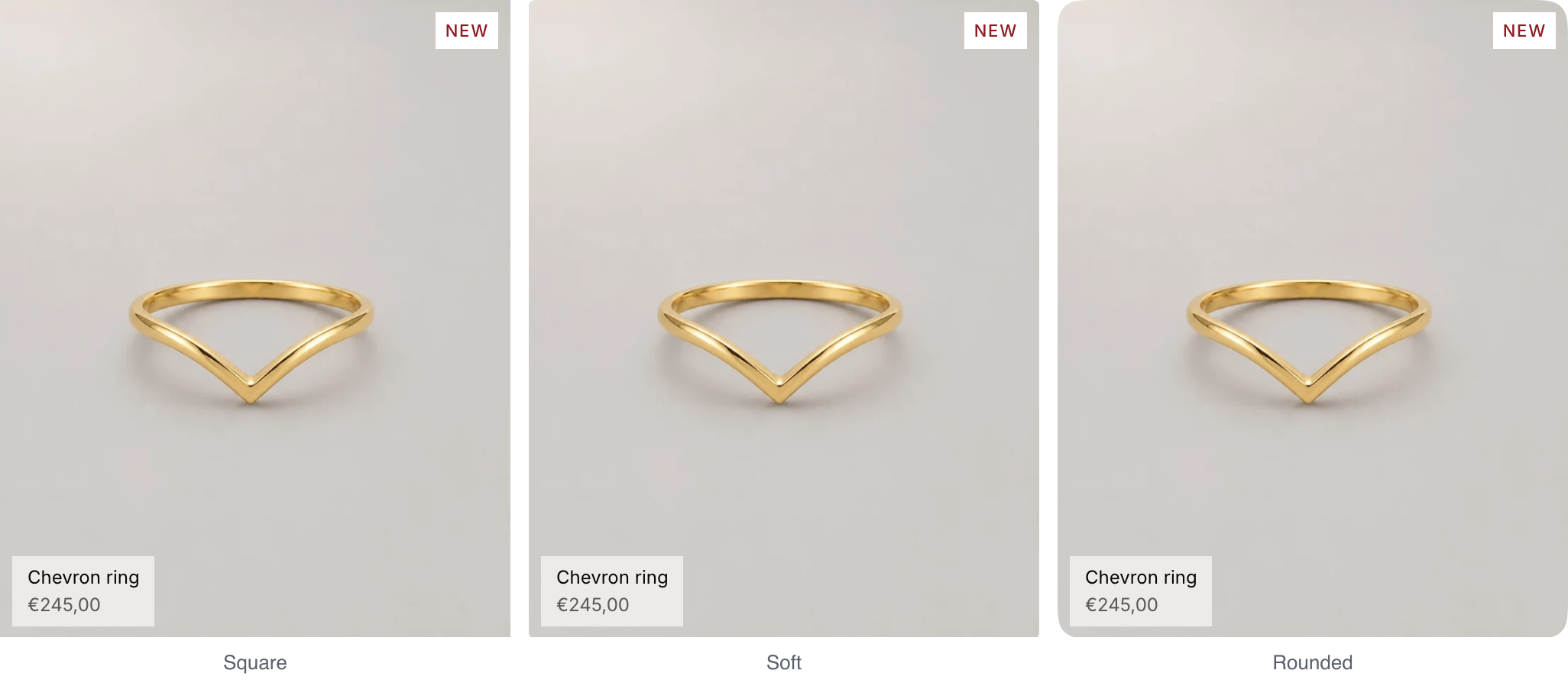
Card images: product, collection, article and menu cards.
Animations
Roll prices when they change: the digits roll to the new price when a shopper picks another variant. Installs on. Visitors who turn off motion on their device see the new price without the roll.

Zoom images on hover: card images grow slightly under the pointer. Installs on.
Good to know#
Can I hide breadcrumbs on one page only?
Show breadcrumbs applies to the whole store. Some sections, such as Collection banner, have their own breadcrumbs setting.