

Media gallery and full-screen viewer
Set the product gallery's layout, photo shape and fit, show only the chosen variant's photos, add labels from alt text, and set up the full-screen viewer.
The Media gallery block shows the product's photos, videos and 3D models, and opens them in a full-screen viewer. It's fixed in Product information: you can change its settings but not move it. The Featured product section uses the same block.
Set it up#
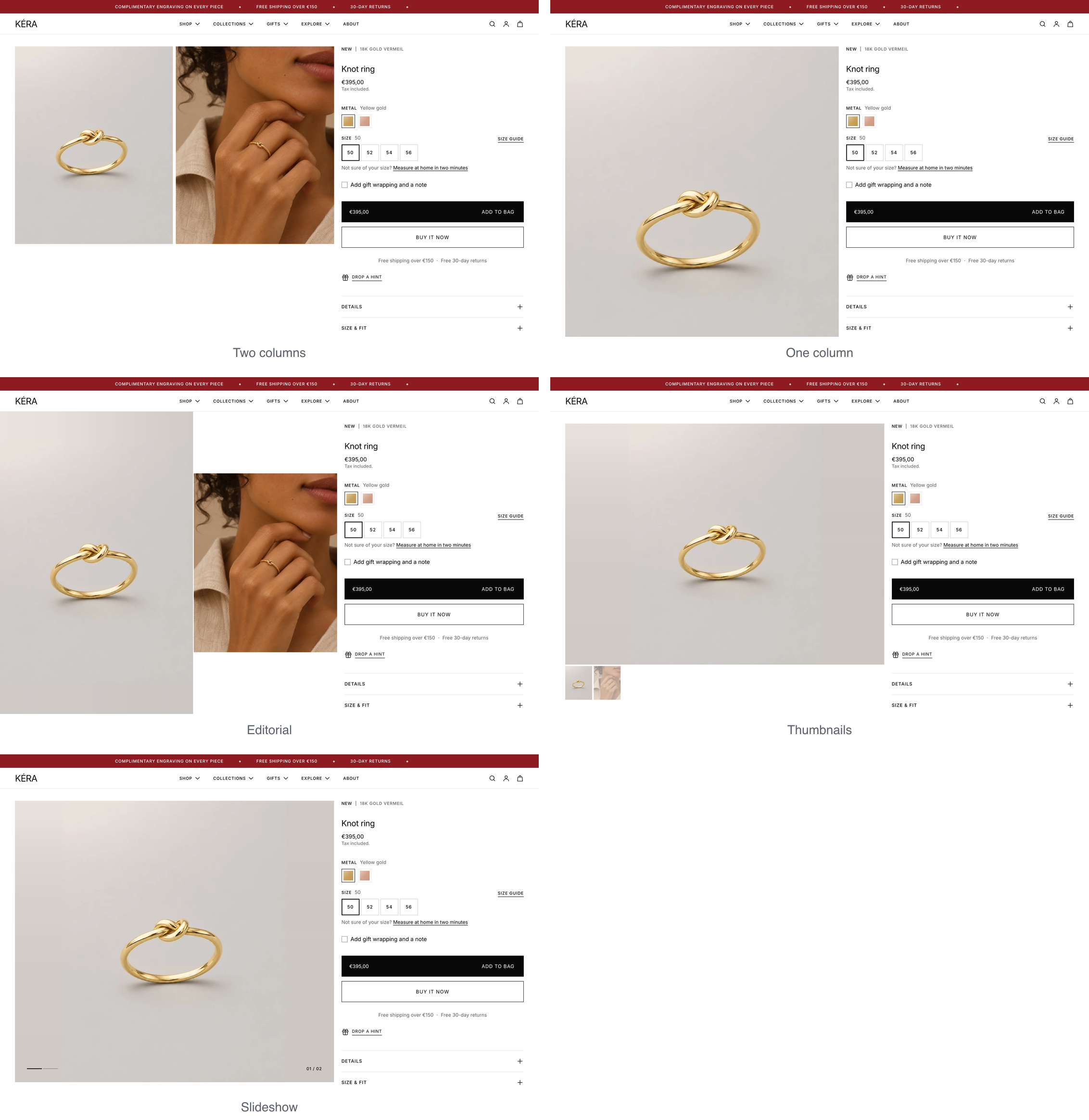
- Select the Media gallery block and pick a Layout: Two columns, One column, Editorial, Thumbnails or Slideshow.
- Pick a Gallery size: Framed stays inside the page margins; Full view runs to the screen edge and fills the screen height on desktop.
- Pick a Photo shape and a Photo fit: Fill (crop to the box) or Fit (show the whole photo).
- Optional: turn on Selected variant photos only to show just the chosen variant's photos.
On phones every layout shows one photo at a time, swiped.
Settings#
Layout settings
Install states are for the default product template.
Layout: how the photos sit beside the product information. Installs as Thumbnails.
| Setting | What it does |
|---|---|
| Gallery size | Framed or Full view (right under the header). Hidden for Editorial, which always works as Full view. Installs as Full view. |
| Thumbnail position | Left, Right or Below, on desktop. Thumbnails only; phones show them below. Installs as Below. |
| Current thumbnail | Fade the others or Frame. Thumbnails only. Installs as Fade the others. |
| Line and counter color | Slideshow only. Automatic, per photo, Dark, for light photos or Light, for dark photos. Installs as Automatic, per photo. |
| Sticky gallery on desktop | Keeps the gallery in place while the information scrolls. Always on in Full view with Thumbnails or Slideshow; hidden for Editorial. Installs on. |
| Gallery and information gap | On the Product information section: the space beside the gallery, 0 to 160, narrower on small desktop screens. |
Photo settings
| Setting | What it does |
|---|---|
| Photo shape | Original (each photo's own shape), Tall 2:3, Portrait 3:4, Portrait 4:5, Square, Landscape 4:3 or Wide 16:9. In Full view and Editorial, the screen height sets the box on desktop. Installs as Portrait 4:5. |
| Photo fit | Fill (crop to the box): crops photos whose shape differs from the box, so keep the piece away from the edges. Fit (show the whole photo): space around it. Installs as Fit (show the whole photo). |
| Space around the photo | With Fit (show the whole photo). Drawn out from the photo extends a plain backdrop, or uses the page color where there is none. Page background, or Custom color set in Background color. Installs as Drawn out from the photo. |
| Selected variant photos only | Shows only the chosen variant's photos. Installs on. |
| Play videos automatically | Videos uploaded to Shopify play muted on a loop, without controls, with a pause button in the corner; a click anywhere on the video pauses or plays it. They play only while on screen, fade back into their first frame at the end of each loop, and show in the full-screen viewer too. Shoppers who ask their device for reduced motion see the video's first image and a play button. YouTube and Vimeo videos still play on a click. Installs on. |
| Show labels from alt text | Turns words in square brackets in a photo's alt text, such as [Bestseller], into labels on the photo. Shopping feeds may still show the brackets. See Labels in square brackets. Installs on. |
Full-screen viewer settings
| Setting | What it does |
|---|---|
| Full-screen image viewer | Clicking a photo opens it full screen. Installs on. |
| Image size | Whole image shows all of it. Full width fills the whole screen: on larger screens the photo spans the width and scrolls down; on phones it fills the height and pans sideways. Installs as Whole image. |
| Show an image size button | Switches between whole image and full width. Installs on. |
| Full width opens at | Where a photo taller than the screen starts at full width: Top, Middle or Bottom. Phones show the full height and open at the middle of the photo's width. Installs at Top. |
| Image indicators | Thumbnails or Lines and counter. Installs as Thumbnails. |
| Show arrows | Installs on. |
| Full-width control buttons | Gives the close button, arrows and indicators a solid background, for when they are hard to see. Shown when Image size is Full width or the size button is on. Installs off. |
| Controls color scheme | Colors of those buttons. |
Good to know#
How does Selected variant photos only pick photos?
Give each variant its own image (Products > your product > the variant), and order the media so each variant's image comes first, then its other photos. A variant's photos run up to the next image another variant uses. Photos before the first variant image are shared and stay first in the gallery, so a video placed first in the media plays first for every variant. Add #all to an alt text, such as Gift box #all, to show that photo for every variant. A variant with no image shows every photo. With the setting off, all photos show and picking a variant moves to its image.
How do 3D models and "View in your space" work?
Add a 3D model (GLB or USDZ) to the product's media in the Shopify admin. It shows in the gallery with a 3D icon, and shoppers tap it to turn and zoom the model. On phones that support AR, a View in your space button appears under the gallery and opens the model at true size. It needs no setting.